In today’s digital landscape, users are bombarded with notifications across multiple applications. For financial software like Intuit’s products, these notifications can range from critical alerts about account security to helpful tips about tax savings. The challenge we faced was clear: how do we design a notification system that respects users’ attention while ensuring they never miss important information?
The notification challenge
At Intuit, our products serve millions of users managing their finances, taxes, and business operations. Each of these domains generates different types of messages with varying levels of urgency and importance. Before our redesign, notifications appeared inconsistently across our product suite, creating several problems:
- Users missed critical alerts buried among less important notifications
- Notification fatigue led to users ignoring potentially valuable information
- Inconsistent placement created a disjointed user experience across products
- Accessibility concerns arose from notifications that disappeared too quickly or were difficult to find later
Our solution? A comprehensive notification framework built around the concept of screen zones – dedicated areas for specific types of notifications based on their urgency, importance, and required user action.
The research process
We began with extensive research to understand both user needs and industry best practices:
1. User Behavior Analysis
Through heatmaps, user interviews, and analytics, we discovered that users naturally expected different types of information to appear in different areas of the screen. Critical alerts were expected at the center, while informational updates were acceptable in peripheral areas.
2. Competitive Analysis
We studied notification systems across banking, productivity, and enterprise software to identify patterns that users might already be familiar with. This helped us avoid reinventing the wheel while still addressing Intuit-specific challenges.
3. Cognitive Load Assessment
Working with UX researchers, we measured the cognitive impact of notifications appearing in different screen locations and with different visual treatments. This helped us understand how to minimize disruption while maximizing awareness.
Defining the notification zones
Based on our research, we established four distinct notification zones, each with a specific purpose:
Zone 1: Critical Alert Zone (Center Screen)
Reserved for high-priority alerts requiring immediate attention, such as:
- Security breaches or unusual account activity
- Failed payments or transactions
- System outages affecting user data
- Legal compliance requirements
These notifications appear centered on screen with a semi-transparent overlay, requiring explicit user acknowledgment before proceeding.
Zone 2: Task-Related Zone (Within Workflow)
Notifications directly related to the user’s current task appear inline with their workflow:
- Form validation feedback
- Confirmation of completed actions
- Contextual tips related to the current task
- Progress indicators
These notifications are embedded near the relevant UI elements to maintain context without disrupting focus.
Zone 3: Status Zone (Top Right)
General status updates and system information appear in the top-right corner:
- Sync status and background processes
- Connection status
- Scheduled maintenance alerts
- Non-urgent system messages
These notifications appear briefly and then minimize to an icon, allowing users to review them when convenient.
Zone 4: Discovery Zone (Bottom Right)
Educational and promotional content appears in the bottom-right corner:
- New feature announcements
- Tips and educational content
- Personalized recommendations
- Promotional offers
These notifications are the least intrusive, designed to be easily ignored if the user is focused on a task.
Visual hierarchy and accessibility
Beyond spatial organization, we established a visual language for notifications that reinforced their importance:
- Color coding: Red for critical, orange for warnings, blue for information, and green for success
- Motion design: More urgent notifications use more noticeable animations
- Persistence: Critical notifications remain until acknowledged, while informational ones auto-dismiss
- Density: Limiting the number of concurrent notifications to prevent overwhelming users
Accessibility was paramount in our design process. All notifications are:
- Screen reader compatible with appropriate ARIA roles
- Keyboard navigable for users who don’t use a mouse
- Designed with sufficient color contrast for visibility
- Available in a persistent notification center for users who miss the initial display
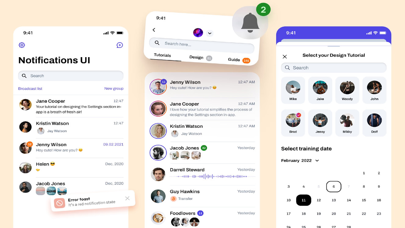
The Notification Control Center
To complement the zoned approach, we created a centralized notification control center where users can:
- Review past notifications they might have missed
- Adjust notification preferences by category
- Set “do not disturb” periods for focused work
- Mark notifications as “read” or “save for later”
This gave users a sense of control over their notification experience while ensuring they could always find important information they might have dismissed.
Testing and iteration
Our initial design underwent extensive testing:
- A/B testing: Comparing different zone layouts with real users
- Cognitive walkthrough: Assessing how well users understood the notification hierarchy
- Accessibility audit: Ensuring all users could effectively interact with notifications
- Performance testing: Measuring the system’s impact on application speed
Based on testing results, we made several refinements:
- Adjusted the persistence timing for Zone 3 notifications
- Enhanced the visual distinction between Zones 3 and 4
- Improved the grouping mechanism for related notifications
- Added customization options for color blind users
Implementation and adoption
Rolling out the framework across Intuit’s product suite required coordination across multiple teams:
- Creating a dedicated notification component library in our design system
- Developing detailed implementation guidelines for product teams
- Establishing governance processes to maintain consistency
- Training designers and developers on the new framework
We phased the implementation across products, starting with QuickBooks and gradually expanding to TurboTax and Mint, allowing us to learn and refine along the way.
Results and impact
Six months after full implementation, the results were compelling:
- 88% decrease in “missed important notification” support tickets
- 23% increase in engagement with educational content in Zone 4
- 91% of users reported better understanding of notification importance
- 14% reduction in notification-related task interruptions
Most importantly, we created a scalable framework that could accommodate new notification types as our products evolved, without confusing users or creating notification fatigue.
Key lessons
The project taught us several valuable lessons about notification design:
- Spatial memory matters: Users quickly learn and remember where to look for different types of information
- Consistency creates trust: When notifications behave predictably, users develop confidence in the system
- Control reduces annoyance: Giving users ways to manage notifications significantly improves satisfaction
- Context determines importance: The same message might belong in different zones depending on the user’s context
Conclusion
Designing a notification framework isn’t just about managing alerts—it’s about respectfully guiding users’ attention in an information-rich environment. By establishing clear zones based on notification importance, we created a system that balances urgency with usability.
The zoned notification framework has become a cornerstone of TurboTax’s design system, creating a consistent experience that users can rely on across our entire product ecosystem. As we continue to refine and evolve this system, we remain committed to the core principle that guided its development: the right information, in the right place, at the right time.