A successful Figma design library isn’t just about components, it’s about the system of tokens, parameters, and modes that make it adaptable, scalable, and truly multi-brand.
Introduction
Design systems are the backbone of scalable digital products. But building one that supports multiple products, multiple teams, and multiple brands is a challenge few design organizations face head-on.
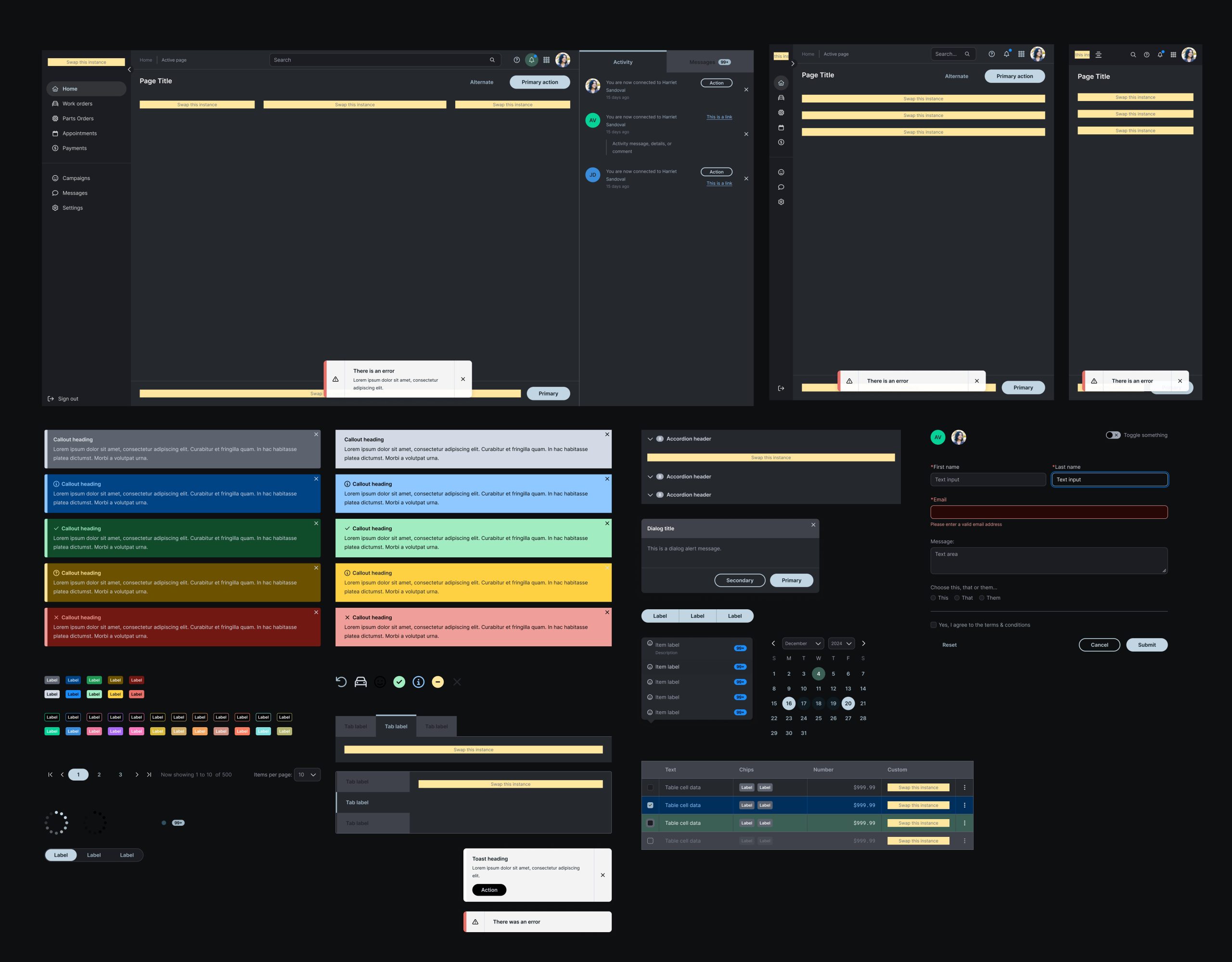
Design systems are more than collections of components, they’re frameworks for scale, consistency, and adaptability. When our team set out to build SocketUI, a Figma-based design library for Dealer-FX and Snap-on Business Solutions, we faced three core challenges:
-
How do we structure tokens for clarity and scalability?
-
How do we make components customizable without breaking consistency?
-
How do we support multiple brands without duplicating effort?
The result was a flexible, multi-brand design system built on strong architectural decisions. This case study shares how we approached the process, from token hierarchy to parameter configuration to leveraging Figma Modes for theming.
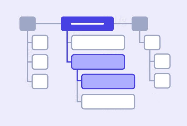
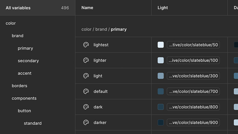
Structuring the Token Architecture
A design system’s strength starts with its tokens — the abstract values for color, typography, spacing, and effects that drive visual consistency.
For SocketUI, token architecture had to serve two purposes:
-
Consistency: Designers should apply the same rules regardless of component or brand.
-
Scalability: Tokens should adapt across multiple brands and product lines.
We built a tiered token structure:
-
Core tokens (raw values like hex colors, font families, pixel units)
-
Semantic tokens (applied roles like color-primary, background-surface, text-secondary)
-
Component tokens (mapped directly to specific UI patterns, such as button-primary-background)
This abstraction allowed us to swap tokens at the brand level without altering the underlying component structure. Designers didn’t need to memorize hex codes — they simply applied semantic roles.
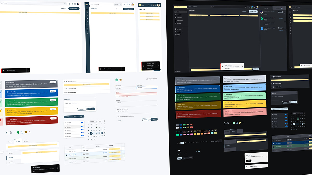
Defining Parameters for Component Customization
Tokens set the foundation, but components bring the system to life. The challenge was to make components highly customizable while keeping them guardrailed against inconsistency.
We leaned heavily into Figma’s component properties and parameters:
-
Boolean properties let designers toggle optional elements (e.g., icon on/off, helper text visible/hidden).
-
Text properties defined content overrides while ensuring consistent typography.
-
Instance swaps allowed icons or nested components to be exchanged without breaking layout.
-
Variants captured size (small, medium, large), state (default, hover, disabled), and style options (filled, outline).
This setup empowered designers to adapt components for context. A button could quickly transform from a small secondary action to a large branded CTA all without leaving the design system.
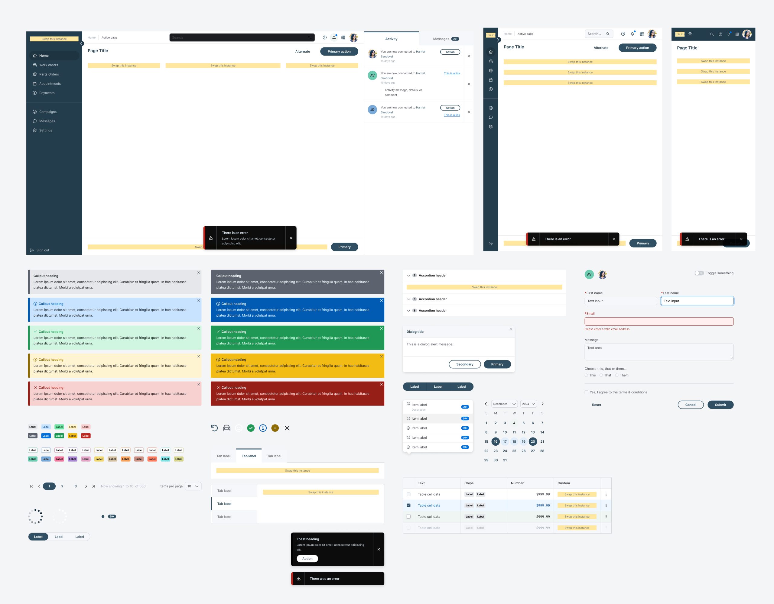
Adding Flexibility with Parameter Configuration
The most unique challenge of SocketUI was multi-brand support. Our products serve multiple OEMs, each with their own brand guidelines. Instead of fragmenting the design system into separate libraries, we built a theming system inside Figma.
The solution came down to tokens and inheritance:
-
Color tokens mapped to semantic roles (primary, background, success) rather than fixed hex values
-
Typography tokens like heading-xl and body-sm for brand-consistent typography
-
Brand token sets that applied directly to base components, so switching a brand theme updated all UI instantly
This structure allowed SocketUI to maintain interaction consistency while respecting brand individuality — one library powering many branded experiences.
Supporting Multi-Brand Experiences with Figma Modes
One of SocketUI’s most important requirements was multi-brand support. Each OEM partner brought its own brand identity (colors, typography, iconography) yet the product experiences needed to remain structurally consistent.
Rather than duplicating libraries for each brand, we leveraged Figma Modes (formerly known as variables in modes) to create a brand theming engine:
-
Color modes stored brand palettes, mapped to semantic tokens like primary, secondary, and surface.
-
Typography modes defined branded type scales, keeping headings, body text, and labels aligned to each identity.
-
Spacing and effects modes allowed subtle brand-specific adjustments (like border radii or shadow depth).
With modes, switching the active brand instantly re-themed the UI all without touching the component structure. This created a single, unified system powering multiple brand experiences.
Lessons Learned
Building SocketUI surfaced a few key takeaways:
-
Semantic tokens are non-negotiable. They unlock scalability and make multi-brand support practical.
-
Parameters create guardrails. Flexibility should never mean chaos — parameters ensure predictable customization.
-
Modes beat duplication. Figma’s modes make it possible to scale across brands without multiplying maintenance overhead.
-
Document early, document often. A design system is only valuable if designers understand how to use it.
Impact
The SocketUI Figma Design Library became more than just a component set, it turned into a scalable design framework. Designers now work faster, developers get clearer specifications, and multi-brand product experiences stay consistent without adding unnecessary complexity.
By focusing on token architecture, parameterized components, and brand theming with modes, SocketUI is positioned to grow alongside the business, no matter how many brands or products it supports in the future.